Help me improve these updates by giving suggestions.
Github Repo -
Deployed on Firebase -
Last week we added basic details page.
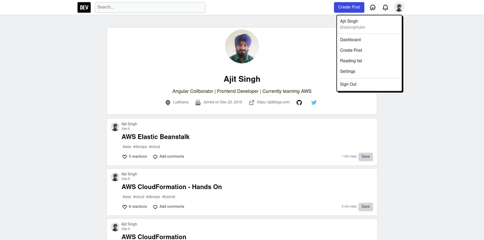
This week I added user details and a reaction section in article details. There is no API for adding reactions to actual dev.to site so the reactions component is read-only for now.
This week I have good news did the listings page for us. I am really happy this is a first opensource contribution in my project. Thanks Chellapan
He implemented the masonry layout in this and next I'll write how he implemented the masonry layout.
Now back to my work this time added a global component store for user details in the article-details component. I also had a lot of problems with the layout of the page the layout was not working correctly whatever I set in the grid-template-columns but after putting a lot of time in it I realized its just that article details content is not working correctly either the image was bigger then the body or the code-snippets were. I was really tired of this, to solved this problem my mind told so what is not styled the details content. This made me realize that the problem should be there. Then I checked and then there it was so for now I made images with width 100% and its working fine for now. This is where we are now.
Next week I'll style article details and on the comments section.
Issue
- The article section is really getting on my nerves. Making so many stores for articles is annoying.
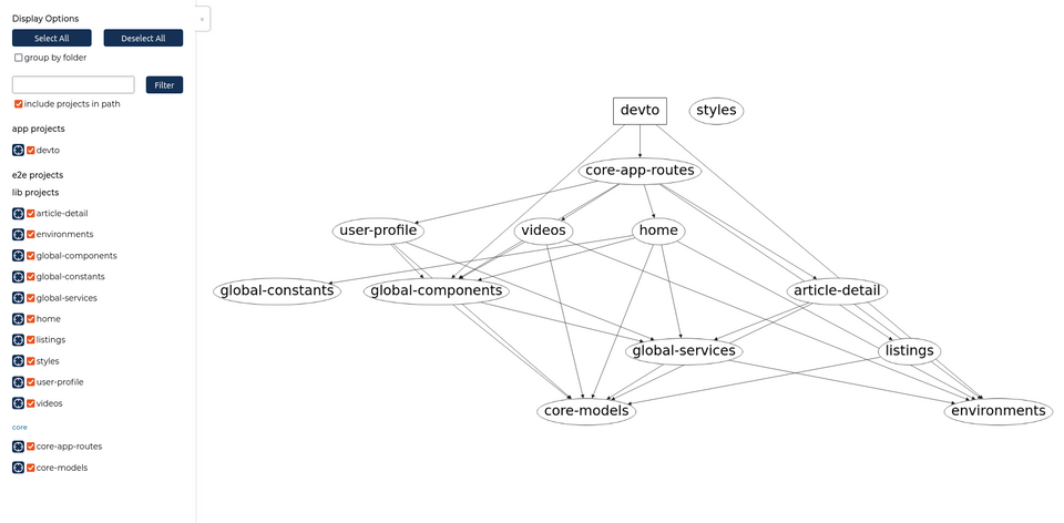
- Moving it to Nx. I've heard a lot about Nx this will be my first Nx project.
Commits done
As you can see a lot of content was added. Now we will soon dive into improving it more using Nx and Tailwind once we finish the basic application.


